


Happy September to all of you Beautiful Butterflies out there!!!
Holy Moly this year is flying by, but I have been very busy working on a new project that I have been keeping under wraps for the past several months. I was asked to illustrate a new book by Jessica Correnti of Kids Grief Support exploring and explaining Grief to children at an age that doesn't fully understand what grief is. The book is called The ABCs of Grief and I have to say I've really enjoyed Jessica's words in this book along with creating illustrations to accompany them. She explains the universalness of grief in such a kind and approachable way. This lovely book is going to be such a great resource for little ones, parents, and caregivers alike. We're currently wrapping up the color/layout phase and will soon find our way into working on the cover for the book. For this post, I thought it would be fun to show you a few little sneak peeks of this upcoming project and some behind-the-scenes photos.

Pictured above are the thumbnail sketches I made to find what look and layout I liked best for each illustration.
Below is one of my favorite little sketches for one of the letters of the alphabet.

After each sketch, I went back through and tidied up each one (essentially layers upon layers of sketches). I love doing this on my iPad. It gives me so much more freedom to edit.

This book has required so many illustrations, so I am bursting at the seams with painted paper. It has been so fun to see them all pile up.

What I love about the illustrations so far is how much they show grief in a realistic way. When we grieve we aren't always sad, sometimes we are happy too.

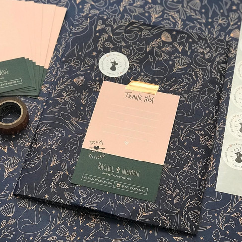
A little in-process shot of one of the illustrations.

One final sneak peek for the road. Below is one of the first illustrations I painted. And if you scroll back up, you can see this piece in the sketching phase :)

Without giving too much away, I'm going to sign off now. I just wanted to share a little preview to get you all excited. This project has been and continues to be such a treat and I can't wait to share it with all of you when it's finished.
Cheers to September, and I will chat with all of you soon, Rachel
- Aug 2, 2023

Hello, my Sweet Beautiful Butterflies!
Happy August...fall is not in the air whatsoever (it's 100+ degrees here today), but I can smell the pumpkin candles filling up store shelves and I can hear whispers of my favorite time of year just around the corner. August is usually when my mind starts to wander to fall, maybe because my inbox is filled with new "autumn clothing lines" or because I too have to think about making new fall/winter artwork. Regardless, I start to get a little giddy about what's to come, despite the fact that it is still a ways away.
So while I patiently await this weather switch and continue to tinker away in my office, a lovely idea popped into my head for this month's post. I'm thinking "A Day in My Life as an Artist". I do get this question a lot, like a lot a lot. What does a day look like for me? When do I wake up? How do I stay organized and on top of things, etc? Soooo, why not share those things in a fun little post for all of you to see?
Let's start with the basics. I work at home, in a spare bedroom in my house. I have lovingly decorated and converted this room into a full-on office studio complete with desk space galore and a chalk wall (main image of that above). I have three desks to be exact: one with my computer, one for printing/packing orders, and one for painting. It's a lot, but I love it and it's generally pretty scattered and messy.

Alright, now that you have the picture, let's dig into what a day looks like for me.
I generally wake up around 7 am (short commute and all allows me a little extra sleep). I get ready pretty quickly (no need for hair and makeup at home alone), and then carry onto the kitchen for my morning coffee. One note of advice for anyone working from home: I still get dressed in regular clothes. I do not stay in my pajamas ever!! I received this advice before starting work from home to help my brain know that I was still "going to work" despite being at home and seriously was the best advice I received. Almost 10 years later, I still stick to this and frequently share with others. Sometimes I'm just throwing on a T-shirt and shorts, but usually I'm putting on a dress, or something fancy because "why not!" The point is, I'm getting out of my PJs, brushing my teeth, and getting into work clothes.
So, onwards from coffee, I like to be at my desk by 8 am to read emails and perform any admin tasks to start my day until 9 am. I also have a handy-dandy notebook by my side where I write out my priorities for the week. Going off of this list, every morning I time-block my day from 9-5 on what I will be working on. This helps to make sure I'm staying on task and feeling accomplished every day.

While every day and every week looks a little different depending on my workload. I like to start out the day by printing out and prepping any orders I may have.


By 10 am, while I may work on client work if I'm extra busy, I typically like to work on stuff for myself. I find I'm a little more motivated to work on personal projects in the morning than in the afternoon. This week, I have a pretty large client job I'm trying to tackle, so I have split my morning between getting a head start on that (mainly sketching and transferring artwork to paper to be painted) and working on some fun personal projects.

12-1: Time for lunch! I don't check my email consistently throughout the day (in fact I have alerts silenced on my computer to stay focused and on task). So instead I check my emails (unless I'm in a time crunch) from 8-9 am, at lunchtime, and at the end of my workday. So, after eating lunch I'll check up on any emails/admin work and pivot my afternoon accordingly if need be.
Once 1 pm hits, it's back to work, usually focusing on client work.
Today as my example, I painted for a client project from 1-2 pm.

2-3 pm - to give me a painting break I worked on sketches for another client project.

3-4 pm - I moved back to painting another couple of layers for client work.

4-5 pm - This is usually left up in the air for me. I like to use it as a time to circle back to anything I maybe didn't get quite as far on for a client, work on personal work a tad bit more if I'm feeling adventurous, or work on the long list of little tasks that compile over the work day (social media, invoicing, quotes, etc.). It's kind of like my open period that I decide how to allocate once I get to it and after assessing what my needs are for that day.

5-5:15/5:30 - Final sweep of emails and admin. This is the perfect time for me to wind down the work day and make sure everything is wrapped up for the day so I'm all set for tomorrow.

So, there you have it. Nothing ground-breaking, but a fun little dive into my day hour by hour (because that's how I break it down). Maybe you will find some help from this and maybe you will realize you like what you're doing waaay more. Regardless, I will see you all in (gasp) September.
xoxo,
Rachel
- Jun 29, 2023

Happy July my Beautiful Butterflies!
We just celebrated the Summer Solstice a couple of weeks ago so I decided this month I wanted to keep it light and fun with a cute little celebration illustration (oh how fun that rhymes). And of course, we're living in the Year of the Rabbit so my lil' cozy rabbit from earlier this year (January...February....I can't remember) is reprising her role in some new digs.
I also wanted to try a little something new with the style. I painted her, per usual, but I thought it would be a bit more crafty if I made everything in a "cut-out" style to give a bit of a paper doll look to the project and to give some depth. I've done this really just a few times before, so I've been itching to play with this look once again.
So, in breaking down the post, I have a handful of pics to show you my process culminating in a video (don't worry it's less than 2 minutes long - and you can watch it without having to listen) showing the assembly of this lil' babe.
I have a few things I've been working on with clients and myself that are in the early enough stages I decided I couldn't share them with you, so alas, I whipped up this light-hearted project to ring in the new season. If you want to skip straight to the video you can find that at the bottom of the page.
AND BONUS!! I have freebie coloring pages to match so you can play along. Scroll to the bottom to snag those downloads.

Okay, so first things first, I doodled this little rabbit pretty quickly on my iPad to get started.

Next, I transferred each element separately over to watercolor paper to paint.

Here you can see these little babes are all painted and ready for the next step.

Okay, my rabbit obviously needs a background, so I whipped up a little set design for her summer frolicking.

The final step before assembly (and video time) is to cut out each piece.
Time to dig into my video!! Click to watch below :)
FREEBIE COLORING PAGE DOWNLOADS

I do hope you all enjoyed this crafty post this month. I know I certainly did.
Until next month,
Rachel


