

- Dec 3, 2024

Hello, my Beautiful December Butterflies!!
Wowzie Wowzie Wowzie, this year has flown by. Truly being a new parent this time last year it was hard to picture one year let alone one week into the future. I took things hour by hour (or minute by minute) at the beginning, so suddenly looking up and realizing how much time had actually passed is just ming boggling. But my friends I am so excited for the holidays. We just celebrated Thanksgiving and Leonora's first birthday and now we're in full swing of the holidays. I know your inboxes are so heavily bombarded with all the things right now, so I'm keeping it relaxing and cozy for you. I filmed this super cute holiday illustration (it's the December painting from my 2025 wall calendar) and I put it to some chipper holiday music to get you in the spirit.
Speaking of the 2025 calendar, thank you so much for all of the pre-orders!! These are officially being mailed out this week!! If you would like to purchase your calendar before 2025 hits, the pre-sale has ended and it's officially available for immediate purchase here (yay to calendars!!).
I hope you have an amazing rest of year and I can't wait to see you in your inbox in January!!
Happy Holidays, Rachel
- Nov 1, 2024

It's been months in the making, but holy bananas I did it. I hand-painted 12 new illustrations to make a wall calendar for 2025!!
So......let's talk the talk. I have a running list of things I would love to make or do. And every year I revisit that list and decide in January which ones I want to focus on. Because I'm terrible at doing things minimally I end up throwing ALL of these pipe dreams on my to-do list for the year and come December I've done just a few of the thirty things I set out to do. I end up feeling like a slacker despite all of my other accomplishments. This year, was different though. After maternity leave, I wrote on my to-do list that I would work smart and simple this year. So I looked at the massive pipe dream list and highlighted just 5 things to focus on. One of those five things was a wall calendar. I have wanted to make one of these for ages, but I run out of time every year.
This year though, I decided to begin in the summer. I started sketching, doodling, painting, filming, and now printing!!!! I never really knew what I wanted the theme or style to be in years past, but this year being a new mom, things hit differently. I remembered this Campbell's soup calendar that my Grandma had when I was a kid. It had such fun nostalgic and very seasonal illustrations. I loved flipping through it every year to see what each month would bring (images below of some of the calendars)


So, this year, I decided to make my own version of it (minus the soup). For most of the illustrations, I leaned into the snacks and the seasonal vibes pretty hardcore, and I LOVE what I put together.
The best part, I had SO much fun painting these. So much fun, that I've been filming them come together and sharing a few of them on youtube (you were getting sneak peeks and you didn't even know it!!!).
There was definitely a moment I didn't think I was going to finish this calendar in time, but to my surprise I pulled it off. I officially have this little baby available for PRE-ORDER so I can get a proper gauge of how many to order.


I cannot tell you how excited and proud I am of this project. It was a project for my inner child, for my little baby girl, and for all of you to inspire some imagination each month. Below are some sneak peek pics!!! And a link to pre-order the calendar!!! I plan on shipping all of the pre-orders out at the beginning of December. Just in time to hang them up on your wall for January 2025.

I will see you all sooooooooooon
xoxo
Rachel
- Oct 1, 2024

Happy October my Pleasant Peaceful Pumpkins!!!
Ahhhhhh I literally cannot believe October is here. I haven't yet.....but I fully intend to dive deeply into all things pumpkin-flavored now that we're officially in October. I've been eyeing an insane amount of pumpkin-flavored recipes both savory and sweet. And I just finished doing a lovely little fall Halloween refresh in the house (think ghost paintings, candlesticks, twinkly lights, little pumpkins, and hanging witch hats).
September flew by in the blink of an eye because we were out of town for most of it. I feel like I entered a time machine a bit, but we have returned to the end of September and the start of all the fall vibes ( so exciting!). So where was I for most of September??
FRANCE!!!!!
Ricky, Leonora, and I took our first BIG International trip together as a family and it was truly magnificent. It definitely wasn't easy traveling internationally with a 9 month old, but it was soooo worth it. We had a blast and got to experience September in much cooler temps and amazing beauty.
We started off the trip in Annecy, France - a small town by a gorgeous mountain-lined lake at the feet of the Alps. Then jumped to Chamonix which sits smack dab in the Alps at the foot of Mont Blanc (the largest mountain in Europe). We had amazing views every day and took Leonora on a few hikes and her first gondola ride. We rounded out the trip with some relaxing days in Paris, strolling the streets, eating pastries, and taking in the Eiffel Tower with the Olympic rings on it (seriously so cool to see).
I was so sad to leave, but we returned to Houston ready for all that fall brings.
Since I was gone for most of September I thought it would be more fun to share some photos of our French Family Adventure!! Hope you enjoy these pics and I will see you in November.
xoxo
Rachel

This lovely place is called Lake Annecy, about an hour and a half outside of Lyon, France.

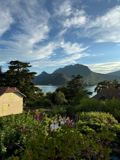


We did a few small hikes, explored the old town that has major fairytale vibes, and enjoyed the view from our hotel of the lake.

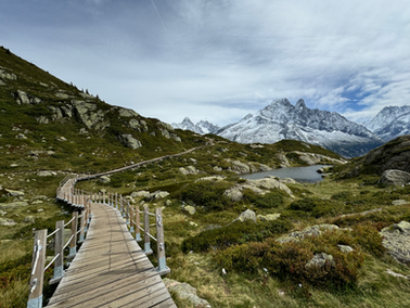
Enter Chamonix...my favorite part of the trip.


We stopped to take pics at this beautiful mountain pass and to feed our little Leonora.
This is by far my favorite pic from my favorite day in Chamonix. We went on a lovely hike with amazing views the entire time.


We hiked to our little hearts' content. The Alps are filled with lovely little mountain restaurants that you can hike to, enjoy a bite and a drink, enjoy the views, and then hike on your merry way.


More pics from my favorite day!!

Next, we hit up Paris to round out our trip. Leonora got to take her first train and subway ride too.

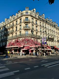


We spent our time in Paris going to art galleries, roaming the beautiful streets, exploring the catacombs (perfect for pre-Halloween vibes), and eating at lovely cafes. It was a dream. So so sad to leave but we had a lovely time and I can't wait to go on our next adventure with Leonora.


